blob: f17760ae200f5b5b0095d04b073382742d783b58 (
plain)
1
2
3
4
5
6
7
8
9
10
11
12
13
14
15
16
17
18
19
20
21
22
23
24
25
26
27
28
29
30
31
32
33
34
35
36
|
This piece aims to highlight (pun intended) some of the
reasons behind my [color
free](https://u.peppe.rs/bF.png) editor setup.
Imagine highlighting an entire book because *all* of it is
important. That is exactly what (most) syntax highlighting
does. It is difficult for the human eye to filter out noise
in rainbow barf. Use color to draw attention, not diverge
it.
At the same time, a book devoid of color is *boring!* What
is the takeaway from this 10 line paragraph? What are the
technical terms used?
Prose and code are certainly different, but the fickle
minded human eye is the same. The eye constantly looks for a
frame of reference, a focal point. It grows tired when it
can't find one.
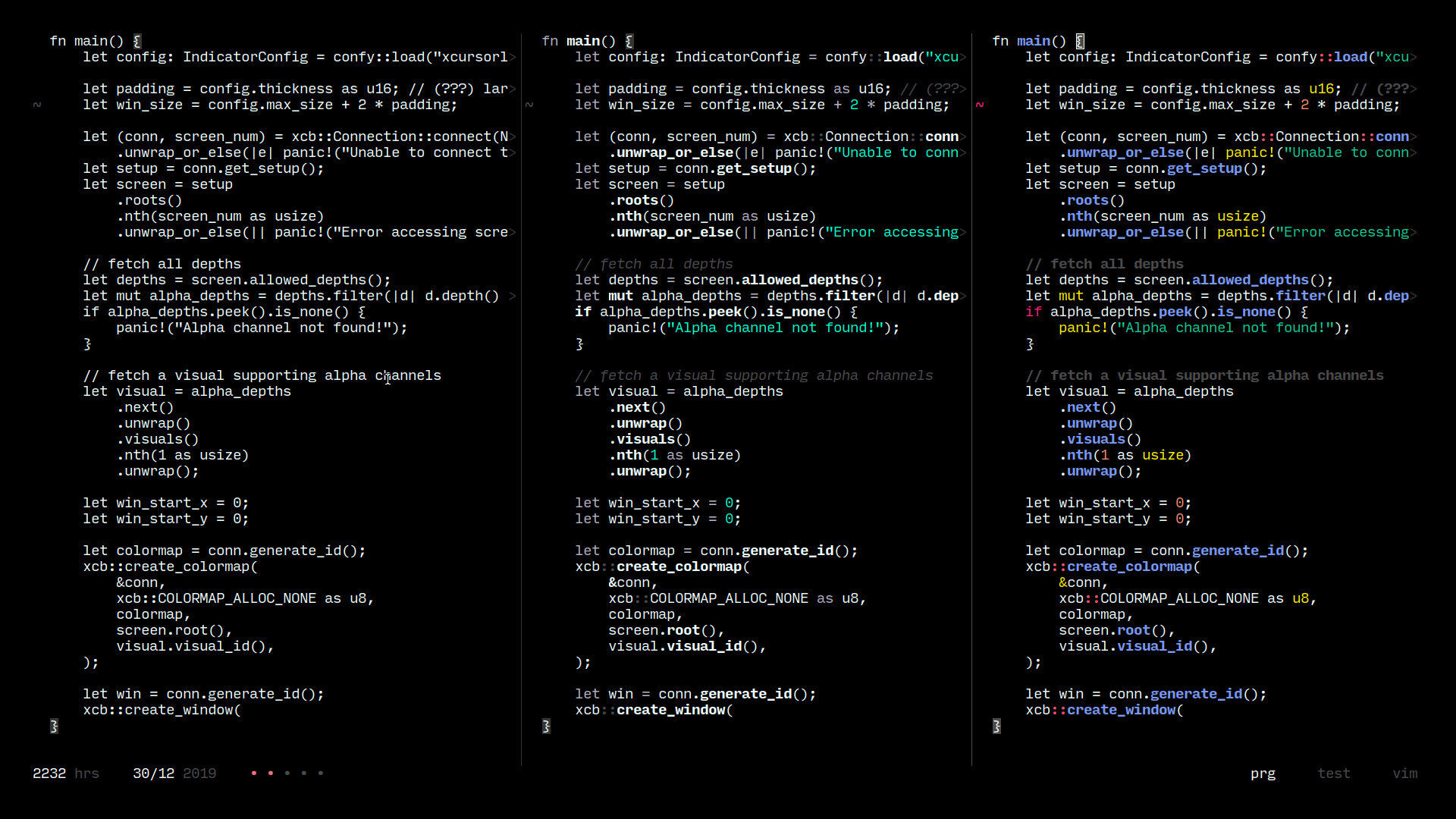
The following comparison does a better job of explaining
(none, ample and over-the-top highlighting, from left to
right):
[](https://u.peppe.rs/lt.png)
Without highlighting (far left), it is hard to differentiate
between comments and code! The florid color scheme (far
right) is no good either, it contains too many attention
grabbers. The center sample is a healthy balance of both.
Function calls and constants stand out, and repetitive
keywords and other noise (`let`, `as`) are mildly dimmed
out. Comments and non-code text (sign column, status text)
are dimmed further.
I'll stop myself before I rant about color contrast and
combinations.
|