1
2
3
4
5
6
7
8
9
10
11
12
13
14
15
16
17
18
19
20
21
22
23
24
25
26
27
28
29
30
31
32
33
34
35
36
37
38
39
40
41
42
43
44
45
46
47
48
49
50
51
52
53
54
55
56
57
58
59
60
61
62
63
64
65
66
67
68
69
70
71
72
73
74
75
76
77
78
79
80
81
82
83
84
85
86
87
88
89
90
91
92
93
94
95
96
97
98
99
100
101
102
103
104
105
106
107
108
109
110
111
112
113
114
115
116
117
118
119
120
121
122
123
124
125
126
127
128
129
130
131
132
133
134
135
136
137
138
139
|
I've always been an admirer of pixel art, because of it's
simplicity and it's resemblance to bitmap font design.
Recently, I decided to take the dive and make some art of my
own.
I used GIMP because I am fairly familiar with it. Aseprite
seems to be the editor of choice for animated pixel art
though.
### Setting up the canvas
Picking a canvas size is daunting. Too small, and you won't
be able to fit in enough detail to make a legible piece. Too
big and you've got too many pixels to work with!
I would suggest starting out with anywhere between 100x100
and 200x200. [Here's](https://u.peppe.rs/u9.png) a sample
configuration.
Sometimes I use a 10x10 grid, `View > Show Grid` and `Edit >
Preferences > Default Grid > Spacing`, but that can get
jarring, so I throw down a couple of guides, drag right or
down from the left or top gutters for vertical and
horizontal guides respectively.
### Choosing a Brush
The most important part of our setup is the brush. Use the
Pencil Tool (`n` on the keyboard) for hard edge drawings.
Here's a small comparison if you don't know the difference
between a hard edge and a soft edge:
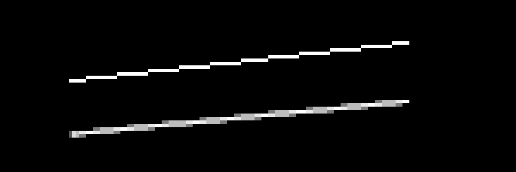
I turn the size down all the way to 1 (`[` on the keyboard).
Set `Dynamics` off. [Here's](https://u.peppe.rs/Fs.png) a
sample brush configuration.
### Laying down the pixels!
With the boring stuff out of the way, we can start with our
piece. I usually follow a three step process:
- draw a rough outline
- fill in the shadows
- add highlights
But this process is better explained with an example: an
onigiri. Let us start off with a 100x100 canvas.
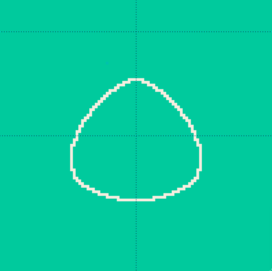
#### Drawing the outline
For the most part, our figure will be symmetric. If you are
on GIMP 2.10+, you can take advantage of the Symmetry
Painting feature. Go ahead and enable vertical symmetry,
`Window > Dockable Dialogs > Symmetry Painting` and
`Symmetry Painting > Symmetry > Mirror > Vertical`.
If you are running an older version of GIMP, draw in the
left side, duplicate the layer, flip it horizontally, and
merge it with the original.
Your outline might look something like this:
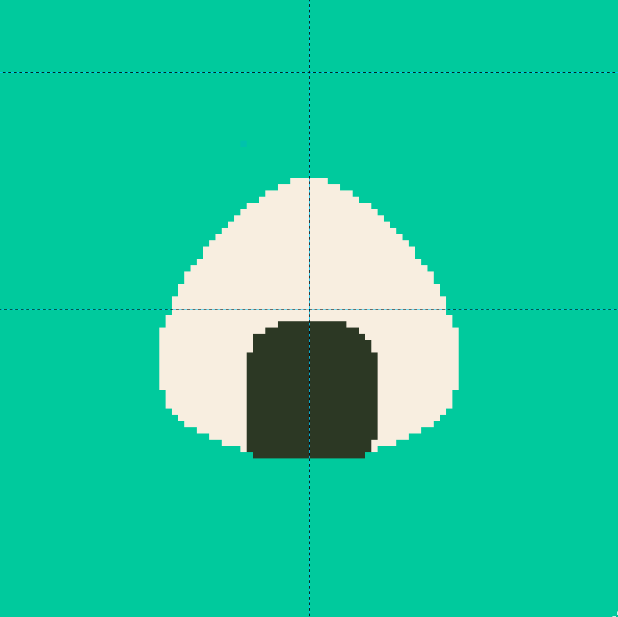
Go ahead and fill it in with the fill tool (`Shift + b` on
the keyboard), add in some seaweed as well, preferably on a
different layer. You can toggle symmetry on and off to save
yourself some time.
#### Shadows
For now, let us focus on the shadows on the object itself,
we'll come back to the shadows cast by the object on the
surface later.
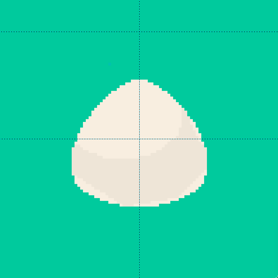
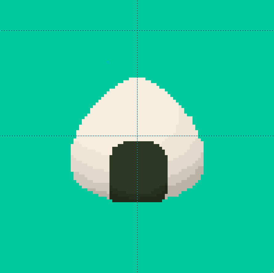
Shadows on any surface always follow the shape of the
surface. A spherical onigiri would have a circular shadow:
A couple of noticeable changes:
**Layers**: The layer containing the seaweed has been hidden.
**Color**: The color of the shadow is just a slightly
lighter version of the original object (reduce the Value on
the HSV scale).
**Area**: The shadow does not go all the way (notice the bottom
edges).
The shadow does not go all the way because we will be
filling in that area with another, darker shadow! An image
might explain better:
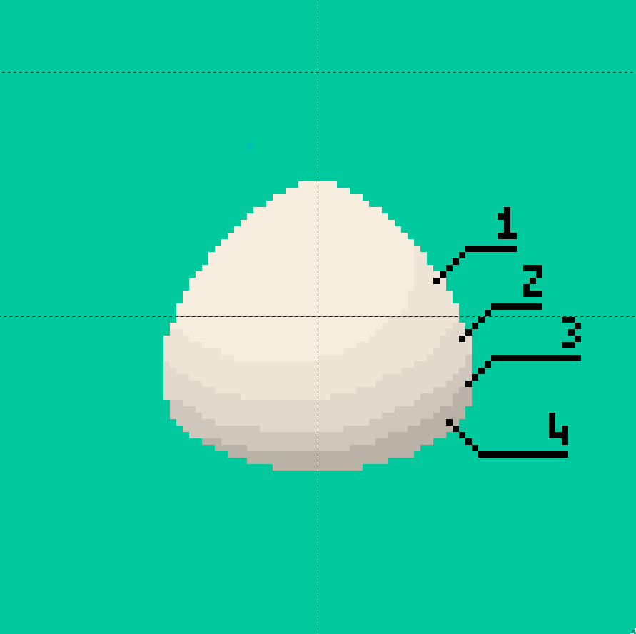
To emulate soft lights, reduce the value by 2 to 3 points
every iteration. Notice how area `1` is much larger than
area `4`. This is because an onigiri resembles a bottom
heavy oblate spheroid, a sphere that is slightly fatter
around the lower bottom, and areas `1` and `2` catch more
light than areas `3` and `4`.
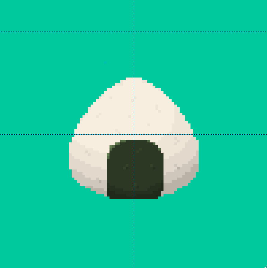
Do the same with the seaweed. The seaweed, being a smaller,
flatter object, doesn't cast much of a shadow, so stop with
1 or 2 iterations of the gradient:
We're getting there!
#### Highlights
This step handles the details on the strongly illuminated
portions of the object. Seaweed is a bit glossy, lighten the
edges to make it seem shiny. The rice is not as shiny, but
it does form an uneven surface. Add in some shadows to
promote the idea of rice grains. Here is the finished
result:
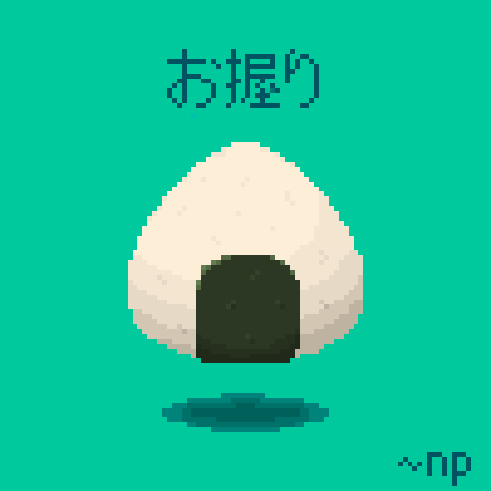
### Finishing Touches
Some color correction and `a e s t h e t i c` Japanese text
later, our piece is complete!

Hold on, why is it so tiny? Well, that's because our canvas
was 100x100, head over to `Image > Scale Image`, set
`Quality > Interpolation` to `None` and scale it up to
700x700, et voilà!
|